The newest generation of satellites reveals plankton variability changes in character from uniform to chaotic at different spatial scales, reviving a classic question in oceanography. How does plankton variability change at different spatial scales, and why?
New satellites, new insights
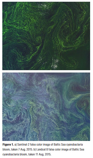
Satellite technologies can now collect images with resolution down to the scale of meters, presenting oceanographers data with unprecedented information about the fine-scale structure of plankton communities in the surface ocean. In August 2015, there was significant media attention after two of the world’s most advanced satellites, Landsat 8 and Sentinel-2, published images of a cyanobacteria (algal) bloom in the Baltic sea (Fig. 1). For scale, the images conveniently have boats in them (you really have to squint, or just zoom in – a little game of Where’s Waldo at sea).
While these images are beautiful in their own right, to an oceanographer they also illustrate the complexity of the biophysical interactions that drive plankton distributions. When we run computer models to simulate e.g., how plankton communities might respond to a changing climate, we can’t replicate all of this variability, so we typically represent an X km × Y km square of ocean with a single value (e.g., plankton concentration), which we consider as the average for that box; one peek at an image like this demonstrates that it’s difficult to justify this approach as doing full justice to the system it’s simulating. Similarly, when we take samples out in the field, we often fill bottles with seawater and assume that sample represents a X km × Y km area around it. This image suggests that taking a measurement off one side of the boat might give you a very different representation of that region than if you had taken it off the other side! These approaches are further complicated by studies indicating that the variability we see in these images persists at microscopic scales.
This is not meant to needlessly criticize these approaches; oceanography is a challenging science, and we do the best we can. Often, these approaches can yield wonderful insights. These images just draw attention to the fact that plankton spatial variability remains a fascinating and open problem in oceanography, which present-day technology puts us in good position to start addressing.
Characterizing variability
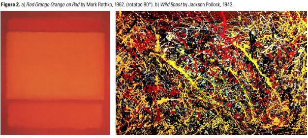
One way we can characterize such variability is by using a power spectral density (PSD), which allows us to quantify how much variability is contained at each scale in an image. Computing the PSD for each of the above images is a straightforward exercise, thanks to modern computational capabilities. To draw an analogy, we can also compute the PSD for a painting by each of Rothko and Pollock (Figs. 2a. and 2b., respectively); we might take the former to represent ’homogeneity’ and the latter to represent ’chaos’ (as Pollock’s paintings have been thought of for years). That is, imagine a satellite looks down on a plankton bloom and sees a rather gargantuan painting of each type; how do these paintings compare with observed blooms, in terms of spatial variability?
Methods
The PSD has been computed for the red band of the RGB image of the Rothko painting, a black and white conversion of the Pollock painting, and for the green band of each of the satellite images. Computing the PSD for other configurations did not change the result. The wavenumber k = 1 in this case corresponds to a wavelength λ ≈ 50 km. Wavenumbers have been rescaled to those of the Sentinel-2 image, and PSDs have been normalized to their L2 norm.
Comparing power spectral densities
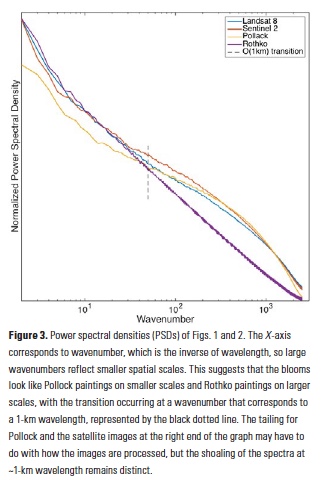
When we computed the PSDs for these four images (Figs. 1a, b and 2a, b), we found remarkable consistency (almost identical PSDs) between the two satellite images (Figs. 1a and b), which were taken four days apart. This suggests that 1) the satellites are accurately and reproducibly capturing spatial bloom variability, and 2) bloom PSDs don’t change significantly from day to day. The PSDs from the satellite images matched the Pollock spectrum at smaller spatial scales (i.e. high wavenumber) and the Rothko spectrum at larger spatial scales (i.e. low wavenumber) (Fig. 3). This raises the question: why might this be happening? Also, at what scale does the ’Rothko-Pollock’ transition occur and why?
Significance
If the distribution of plankton was purely that of Brownian (random) motion, we’d expect a flatter PSD (i.e. a line with slope = -2). Another null hypothesis is that the distribution of plankton might be set passively by advection of oceanic currents. In this case, we’d expect plankton distributions to have the same signature as temperature, which also has a PSD slope of -2. However, these spectra (Fig. 3) have slopes that are steeper than -2 (closer to -2.5 or -3), so clearly there’s more afoot. The steeper slope of -3 at larger scales means that variability falls off faster as we look at smaller scales, i.e. something about the plankton distribution is ’homogenizing’ at larger scales. Then, the PSDs get shallower at wavelengths of ~1 km, indicating that something kicks in at sub-kilometer scales that introduces more variability. One way to think about this transition, which has been hypothesized since the 1970s (1), is that different processes can dominate at different spatial scales. The specifics of the 70s manner of thinking aren’t quite compatible with these data, but the general concept is plausible. Plankton grow in response to light and nutrient conditions, but also live in a turbulent environment. At large scales, growth occurs somewhat uniformly and is dominated by ambient light and nutrient conditions, whereas smaller-scale biophysical interactions can introduce an additional source of variability in plankton growth. Biophysical variability can occur in many ways, including small-scale horizontal motions that can stir plankton patches into filaments and small-scale vertical motions that can enhance growth locally by bringing up nutrients. In either case, these biophysical interactions are only observable at smaller scales.
Thus, at larger scales, the plankton will be distributed relatively homogeneously as uniform (light-/temperature-driven) growth wins out (. la Rothko), and at smaller scales, they will be distributed heterogeneously as advective processes come into play (à la Pollock). The spatial scale at which this transition occurs is controversial and depends on many factors, though was originally hypothesized to be ~1 km, which here appears plausible. See the vertical line in Fig. 3, which corresponds to a 1-km wavelength and appears to agree well with the scale of the observed transition from Rothko-type to Pollock-type behavior.
Another thing to note is that these cyanobacterial mats (Fig. 1) are very thin and form just at the ocean surface –zoom in and you can see how the boat tracks cut through them. Thus, these patterns may be representative of a different set of physical processes occurring only in the uppermost layer of the ocean.
While two satellite images of the same bloom may not be enough to verify the growth vs. turbulence hypothesis, ’Rothko-type’ versus ’Pollock-type’ behavior may not be quantitative enough descriptions to satisfy any oceanographer, and the equally-complex third dimension isn’t included in these pictures, there is still a clear message here. The spatial resolution available from the newest generation of satellites provides a novel opportunity to approach problems of scale in oceanography.
Author
B. B. Cael (MIT Earth, Atmosphere and Planetary Sciences, Woods Hole Oceanographic Institution)
Acknowledgments
It is a pleasure to thank Bror Jonsson, Mick Follows, Bryan Kaiser, and Amala Mahadevan for useful discussion of this topic.
References
- Denman, K.L., T. Platt, 1976. J. Marine Res. 34, 593-601.


